


请先登录您的atyun账户,方可使用该功能

审核通过后即可使用此功能,请耐心等待~


使用交互式地图和动画可视化伦敦的自行车流动性(下)
2020年01月29日 由 sunlei 发表
225695
0
前文回顾:使用交互式地图和动画可视化伦敦的自行车流动性(上)
上面的代码使用了一种动态的颜色方案,这取决于站点的容量。我们还可以根据每个站点的出发和到达次数,为这些圆形标记实现动态半径方案。我们可以得到我们所称的密度图,显示每个车站的净出发/到达人数。
我在这里使用了一种不同的配色方案(target red和tiffany blue在美国都是注册商标的颜色)来显示某个车站的发车数量是否大于或小于进站数量。大圈标记表示较大的出发-到达差异。
让我们看看早上和晚上高峰时间的密度地图:
[caption id="attachment_50091" align="aligncenter" width="1660"]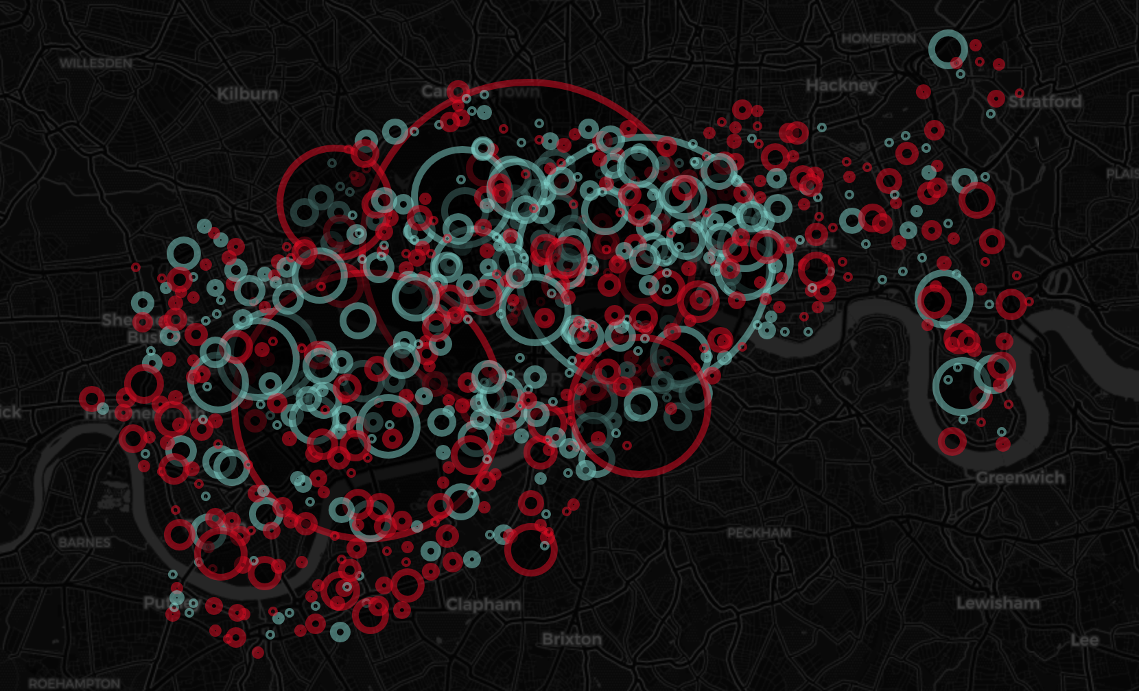 早高峰密度图[/caption]
[caption id="attachment_50092" align="aligncenter" width="1660"]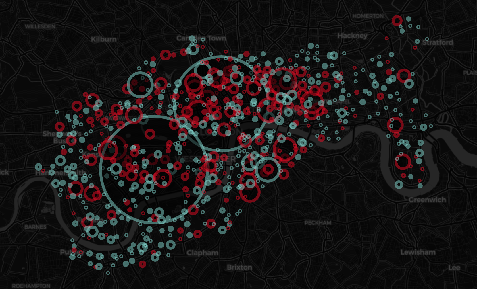 晚高峰时间的密度图[/caption]
密度图可以在https://edenau.github.io/maps/Density-morning/和https://edenau.github.io/maps/Density-weight/上找到。
前面提到的所有地图都只关注站点,而不是行程,但是我们也可以通过所谓的连接地图来可视化行程,通过简单地在地图上绘制完成的行程。没有深入研究很多细节:
[caption id="attachment_50093" align="aligncenter" width="1660"]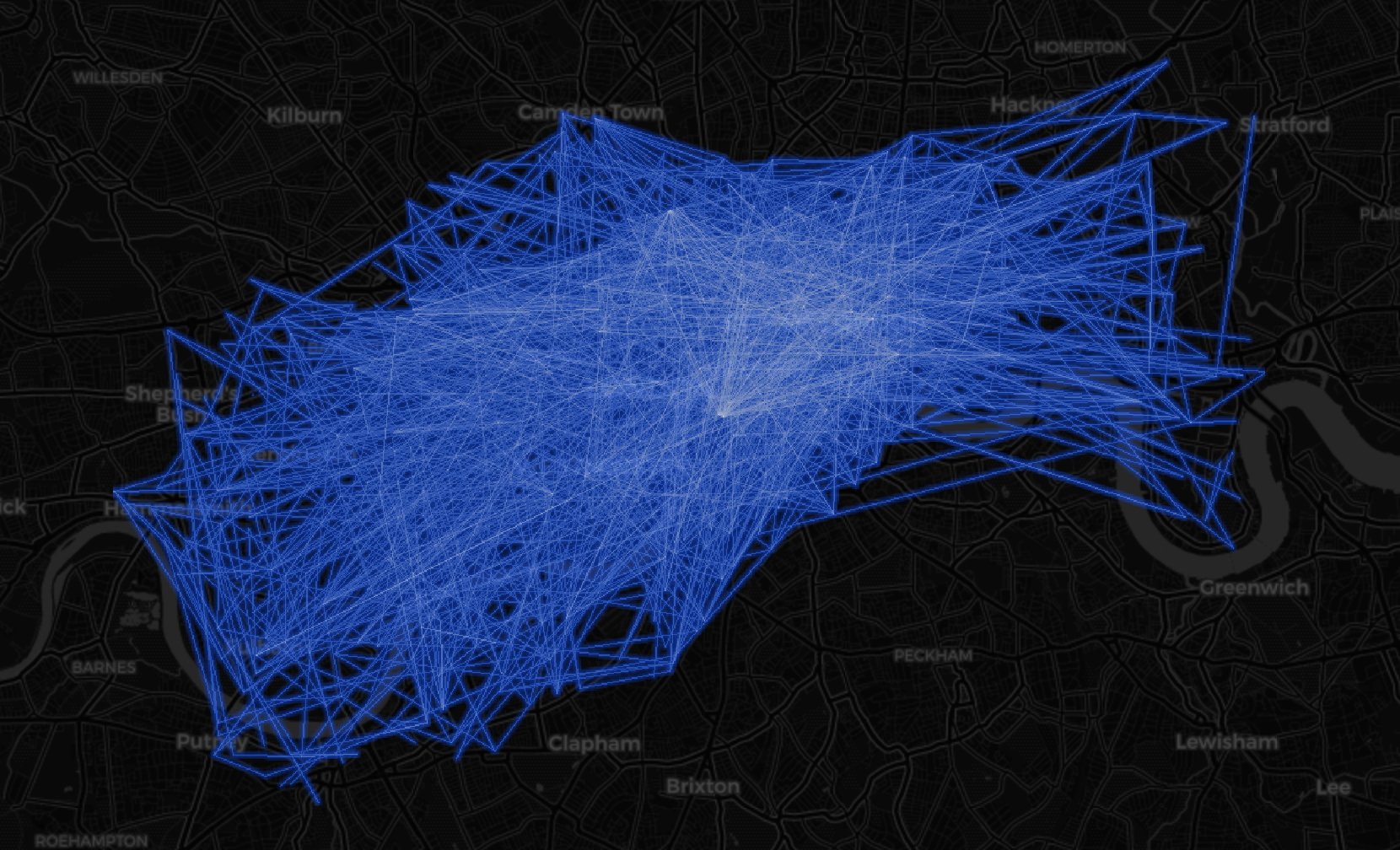 连接图[/caption]
我们还可以通过folium.LayerControl()添加多个连接层,以分隔经常使用和不经常使用的路径层。
[caption id="attachment_50094" align="aligncenter" width="2114"]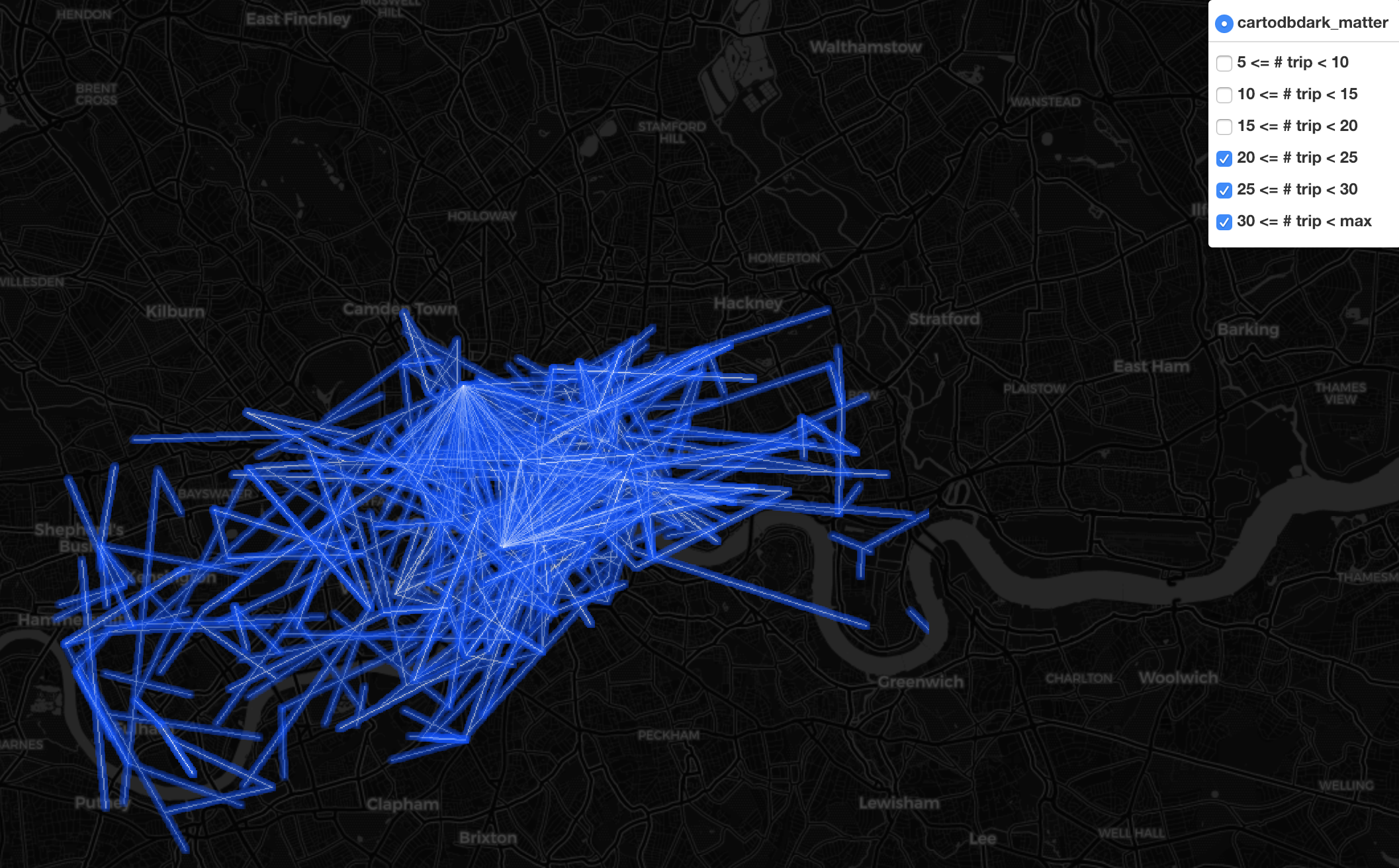 多层连接图[/caption]
连接图可以在https://edenau.github.io/maps/connection-morning-layers/上找到。
到目前为止,我们已经演示了如何通过图表来可视化时间和分布信息,以及通过各种地图来可视化空间信息。但是如果我们在连续的时间实例上生成多个映射呢?我们可以使用动画可视化时空信息!
生成的地图是.html文件中的web地图。其目的是:
为每个时间实例生成一个地图,在web浏览器上浏览,截图并保存图片,然后将所有图片链接一起作为视频或.gif文件。
我们将通过selenium实现web浏览和屏幕捕获过程的自动化。。我们还需要一个网络驱动程序,作为一个Chrome用户,我选择了Chrome driver。
然后我们可以用ffmpeg制作视频或gif。对于Mac用户来说,安装ffmpeg在自制软件的帮助下几乎不费什么力气
自制程序会安装你需要的东西,而苹果不会。
安装Homebrew(使用单个命令)后,只需键入
还有,喂!要创建.mp4文件,请尝试
对于.gif文件,请尝试
查看全天的密度地图动画:
[caption id="attachment_50095" align="aligncenter" width="720"]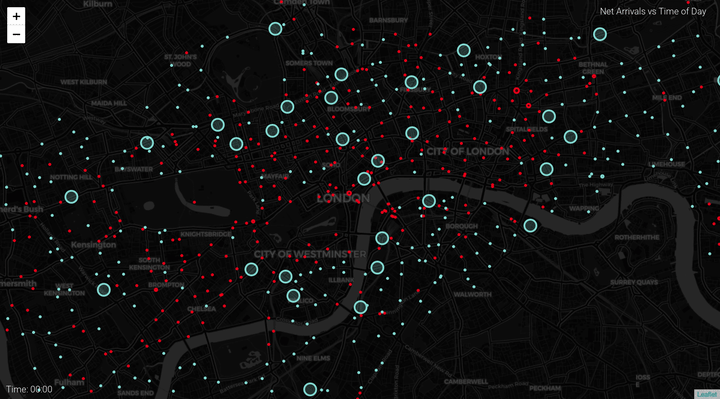 全天的密度地图动画[/caption]
以及不同时期的行程动画:
[caption id="attachment_50096" align="aligncenter" width="720"]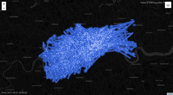 早上的行程动画[/caption]
[caption id="attachment_50097" align="aligncenter" width="720"]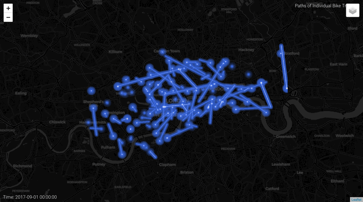 晚上的行程动画[/caption]
伦敦的自行车共享系统使用柱形图、密度图、连接图和动画进行可视化。
Python的抽象使得它成为一个非常好的时空数据可视化工具(以牺牲计算时间为代价)。我利用了folium、selenium、chromedriver、brew、ffmpeg,最重要的是,利用了Vincent代码的部分构建块来实现这一点。
原文链接:https://towardsdatascience.com/visualizing-bike-mobility-in-london-using-interactive-maps-for-absolute-beginners-3b9f55ccb59
密度图
上面的代码使用了一种动态的颜色方案,这取决于站点的容量。我们还可以根据每个站点的出发和到达次数,为这些圆形标记实现动态半径方案。我们可以得到我们所称的密度图,显示每个车站的净出发/到达人数。
def DensityMap(stations, cnt_departure, cnt_arrival):


London = [51.506949, -0.122876]


  map = folium.Map(location = London,

                   zoom_start = 12,

                   tiles = "CartoDB dark_matter")


  stations['Total Departure'] = cnt_departure

  stations['Total Arrival'] = cnt_arrival


for index, row in stations.iterrows():

    net_departure = row['Total Departure'] - row['Total Arrival']


    _radius = np.abs(net_departure)

    if np.isnan(_radius):

      _radius = 0


    if net_departure > 0:

      _color= '#E80018' # target red

    else:

      _color= '#81D8D0' # tiffany blue


    lat, lon = row['lat'], row['lon']

    _popup = '('+str(row['capacity'])+'/'+str(int(_radius))+') '+row['station_name']

    folium.CircleMarker(location = [lat,lon],

                        radius = _radius,

                        popup = _popup,

                        color = _color,

                        fill_opacity = 0.5).add_to(map)


  return map
我在这里使用了一种不同的配色方案(target red和tiffany blue在美国都是注册商标的颜色)来显示某个车站的发车数量是否大于或小于进站数量。大圈标记表示较大的出发-到达差异。
让我们看看早上和晚上高峰时间的密度地图:
# Select peak hours


TimeSlice = [25,53] # morning and evening

keyword = ['map_morning', 'map_evening']


# Journeys depart between 0820 and 0859, and between 1740 and 1819

for ts, kw in zip(TimeSlice, keyword):

  df_1 = df[df["TimeSlice"] == ts]

  df_2 = df[df["TimeSlice"] == (ts+1)]

  df_target = df_1.append(df_2)


  cnt_departure = df_target.groupby("id_start").count().iloc[:,0]

  cnt_arrival = df_target.groupby("id_end").count().iloc[:,0]


  vars()[kw] = DensityMap(stations, cnt_departure, cnt_arrival)
[caption id="attachment_50091" align="aligncenter" width="1660"]
早高峰密度图[/caption][caption id="attachment_50092" align="aligncenter" width="1660"]
晚高峰时间的密度图[/caption]密度图可以在https://edenau.github.io/maps/Density-morning/和https://edenau.github.io/maps/Density-weight/上找到。
连接图
前面提到的所有地图都只关注站点,而不是行程,但是我们也可以通过所谓的连接地图来可视化行程,通过简单地在地图上绘制完成的行程。没有深入研究很多细节:
[caption id="attachment_50093" align="aligncenter" width="1660"]
连接图[/caption]我们还可以通过folium.LayerControl()添加多个连接层,以分隔经常使用和不经常使用的路径层。
[caption id="attachment_50094" align="aligncenter" width="2114"]
多层连接图[/caption]连接图可以在https://edenau.github.io/maps/connection-morning-layers/上找到。
动画
到目前为止,我们已经演示了如何通过图表来可视化时间和分布信息,以及通过各种地图来可视化空间信息。但是如果我们在连续的时间实例上生成多个映射呢?我们可以使用动画可视化时空信息!
生成的地图是.html文件中的web地图。其目的是:
为每个时间实例生成一个地图,在web浏览器上浏览,截图并保存图片,然后将所有图片链接一起作为视频或.gif文件。
我们将通过selenium实现web浏览和屏幕捕获过程的自动化。。我们还需要一个网络驱动程序,作为一个Chrome用户,我选择了Chrome driver。
from selenium import webdriver


def a_frame(i, frame_time, data):

    my_frame = get_image_map(frame_time, data)


    # Save the web map

    delay = 5 # give it some loading time

    fn = 'frame_{:0>5}'.format(i)

    DIR = 'frames'

    f = DIR + '/' + fn + '.html'

    tmpurl='file://{path}/{mapfile}'.format(path=os.getcwd()+

'/frames',mapfile=fn)

    my_frame.save(f)


    # Open the web map and take screenshot

    browser = webdriver.Chrome()

    browser.get(tmpurl)

    time.sleep(delay)

    f = DIR + '/' + fn + '.png'

    browser.save_screenshot(f)

    browser.quit()

    f = 'frames/frame_{:0>5}.png'.format(i)

    image = Image.open(io.BytesIO(f))

    draw = ImageDraw.ImageDraw(image)

    font = ImageFont.truetype('Roboto-Light.ttf', 30)


    # Add text on picture

    draw.text((20, image.height - 50),

              'Time: {}'.format(frame_time),

              fill=(255, 255, 255),

              font=font)


    # Write the .png file

    dir_name = "frames"

    if not os.path.exists(dir_name):

        os.mkdir(dir_name)

    image.save(os.path.join(dir_name, 'frame_{:0>5}.png'.format(i)), 'PNG')


    return image
然后我们可以用ffmpeg制作视频或gif。对于Mac用户来说,安装ffmpeg在自制软件的帮助下几乎不费什么力气
自制程序会安装你需要的东西,而苹果不会。
安装Homebrew(使用单个命令)后,只需键入
$ brew install ffmpeg
还有,喂!要创建.mp4文件,请尝试
$ ffmpeg -r 10 -i frames/frame_%05d.png -c:v libx264 -vf fps=25 -crf 17 -pix_fmt yuv420p video.mp4
对于.gif文件,请尝试
$ ffmpeg -y  -t 3 -i frames/frame_%05d.png \ -vf fps=10,scale=320:-1:flags=lanczos,palettegen palette.png


$ ffmpeg -r 10  -i frames/frame_%05d.png -i palette.png -filter_complex \ "fps=10,scale=720:-1:flags=lanczos[x];[x][1:v]paletteuse" animation.gif
查看全天的密度地图动画:
[caption id="attachment_50095" align="aligncenter" width="720"]
全天的密度地图动画[/caption]以及不同时期的行程动画:
[caption id="attachment_50096" align="aligncenter" width="720"]
早上的行程动画[/caption][caption id="attachment_50097" align="aligncenter" width="720"]
晚上的行程动画[/caption]结论
伦敦的自行车共享系统使用柱形图、密度图、连接图和动画进行可视化。
Python的抽象使得它成为一个非常好的时空数据可视化工具(以牺牲计算时间为代价)。我利用了folium、selenium、chromedriver、brew、ffmpeg,最重要的是,利用了Vincent代码的部分构建块来实现这一点。
原文链接:https://towardsdatascience.com/visualizing-bike-mobility-in-london-using-interactive-maps-for-absolute-beginners-3b9f55ccb59

欢迎关注ATYUN官方公众号
商务合作及内容投稿请联系邮箱:bd@atyun.com


广告


写评论取消
回复取消